Data Storytelling: Where Does Data Fit In? A Beginner’s Guide
Data storytelling is the art of weaving data into a cohesive narrative to create an impactful experience for your audience.
Data storytelling is the art of weaving data into a cohesive narrative to create an impactful experience for your audience.
Data visualization focuses on how you present and communicate information. It also improves learning retention and engages audiences.
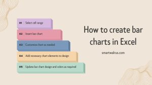
In this article, you will learn how to create bar charts in Excel. with sample data and step-by-step instructions that you can follow along.
In this guide, we will explain the concept of scatterplots and bubble graphs, and discuss the advantages and disadvantages of each.
This guide will take you through the basics of Excel data visualization, including 20 of the most eye-catching charts, graphs, and plots.
This guide will help you build a successful foundation for your future with data visualization career tips to prepare for the job market.
This article will highlight the 10 best data visualization tools and software on the market today that will suit your business needs.
We’ll show you some of the key tools to effectively visualize data and how they can help you succeed in a data visualization career.