Scatterplots vs Bubble Graphs: What’s the Difference?
Scatterplots vs Bubble Graphs
Scatterplots and bubble graphs are powerful visualizations for making connections between different variables. But what’s the difference between these two types of graphs?
In this guide, we will explain the concept of scatterplots and bubble graphs including their advantages and disadvantages. By the end of this guide, you will be able to interpret scatterplots and bubble graphs to understand your data.
Table Comparison: Scatterplot vs Bubble Graphs
For your reference, here’s a comparison table between scatterplots and bubble graphs:
| Aspect | Scatterplots | Bubble Graphs |
|---|---|---|
| Data Representation | Depicts individual data points as dots on a 2D plane. | Similar to scatterplots but includes an additional dimension using bubble size. |
| Data Dimensions | Shows the relationship between two variables. | Shows the relationship between three variables: two on the X and Y axes and the third through bubble size. |
| Bubble Size | All data points have the same size. | Bubble size represents the value of the third variable. |
| Use Case | Useful for visualizing the correlation between two variables. | Used when you want to compare three variables, with two on a standard plane and the third as bubble size. |
| Interpretation | Density and distribution of points in the plot. | Density, distribution, and the relationship between three variables. |
| Complexity | Simpler to create, interpret, and read. | Slightly more complex due to the addition of bubble size. |
| Data Overlap | May experience data overlap, making it hard to distinguish individual points. | Overlapping bubbles can make it challenging to discern individual values. |
| Data Scale | Suitable for small to moderate data sets. | Effective for visualizing moderate to large data sets. |
| Variability | Limited variability as all points have the same size. | Allows visualizing variability of three variables simultaneously. |
| Additional Insights | Limited insights into the third variable, as it’s not directly represented. | Provides insights into the third variable through bubble size. |
| Color Usage | Can use color to differentiate data points, but bubble size is more prominent. | Color and bubble size both play a role in distinguishing data points. |
| Software Usage | Supported by various charting libraries and software. | Supported by charting libraries, but might require more complex customization. |
What Is a Scatterplot?
A scatterplot, also known as a scatter graph, scatter chart, or XY chart, is a type of graph for visualizing the relationship between two numerical values. For instance, it could be the relationship between the amount of money spent on advertising and the number of sales made.
In a scatterplot, the values for each variable are represented by a point on the graph, where each point is plotted on the X and Y axes. The X axis (or independent variable) refers to the variable that is being changed, while the Y axis (or dependent variable) refers to the variable that is being observed and recorded as the value changes.
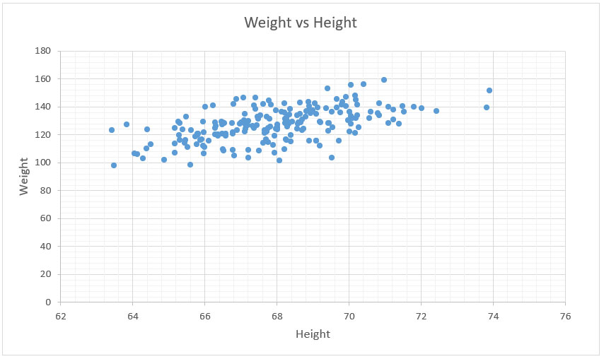
In the example below, we have a scatter plot showing the relationship between height and weight. As expected, it has a positive relationship meaning that data points trend upwards from left to right.
What Is a Bubble Graph?
A bubble graph, or bubble chart, is another type of graph that you can use to visualize the relationship between two numerical values. A bubble graph is essentially a scatterplot with bubbles on the graph that emphasize certain aspects of the data.
The bubbles in a bubble graph show the relative size of two values that you can compare. Bubble graphs are useful for comparing data that you are measuring on two different scales.
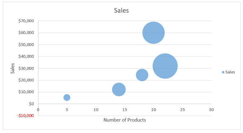
For example, the graph below shows the total sales amount on the y-axis. Next, the x-axis shows the number of products sold. The size of each bubble represents the percentage of market share.
Advantages of Scatterplots and Bubble Graphs
Here are some of the major advantages and disadvantages of these types of graphs:

Disadvantages of Scatterplots and Bubble Graphs
Here are some of the limitations of these types of graphs:
How To Use Scatterplots and Bubble Graphs
There are a wide variety of uses for scatterplots and bubble graphs. Here are some of their use cases:
- Scientific researchers use scatterplots such as in the fields of psychology, sociology, economics, and statistics.
- Bubble graphs are often found in business and marketing contexts. In these fields, businesses use scatterplots to make predictions based on past data and understand customer trends.
- The healthcare industry uses scatterplots to track the progress of patients who are being treated for various conditions, such as cancer and diabetes.
- Scatterplots are also commonly used in the field of sports, where they are used to analyze player performance and determine team strengths and weaknesses.
- In the field of education, scatterplots can monitor student progress and determine areas where you can add additional training and attention.
Conclusion
Scatterplot and bubble graphs both help readers understand both the direction and strength of the relationship between these two variables. But the main difference is that bubble graphs also show magnitude corresponding to their size
These are just two of the popular chart and graph types. Learn more with these 20 data visualizations from Excel. Plus, we’ve listed some of their main use cases and applications in the world today. Did we miss anything? Please let us know with a comment below.
Related Data Visualization
What is Data Visualization and Why Do We Need It?
A Comprehensive Guide to Paving a Career in Data Visualization
How to Create a Bar Chart in Excel
Excel Data Visualization: 20 Charts, Graphs, and Plots To Master
Tips For Pursuing a Career in Data Visualization
Data Storytelling: Where Does Data Fit In? A Beginner’s Guide
10 Best Data Visualization Tools and Software For Your Business