What is Data Visualization and Why Do We Need It?
Data visualization is an essential skill for any modern data analyst. Whether it’s making sense of a mountain of unorganized data, pulling insights from a pile of spreadsheets, or simply making sure your boss sees the important information you want them to see, data visualizations are an essential tool in every data analyst’s arsenal.
So what is data visualization? Data visualization focuses on how you present and communicate information. There are many benefits to using data visualizations such as improving learning retention, engaging audiences, and reducing cognitive load.
In this blog post, we are going to explore several different examples of when and why you would use data visualizations in your research projects – from representing complex relationships between variables to presenting findings in an easily digestible format for your audience.
Finding Important Findings in a Pile of Data

Why should you consider using data visualization? Well, data visualization is a tool to help you make sense of a lot of data. If you have thousands or even millions of data points, it can be very difficult to pinpoint any important findings.
Even if you know where to look, it can be very time-consuming to wade through every single result and make sense of it all. When you are a data analyst, you will spend a lot of time sifting through data and searching for valuable insights.
One of the keys to being a successful data analyst is being able to quickly find relevant data to support your research. Finding interesting results in a pile of data is an essential skill that you can do using data visualization.
Representing Complex Relationships Between Variables

You’ve collected all this data. Now what? As you’ve seen in the previous section, visualizing your data can be a great way to quickly find the information you need. When you’re looking at a ton of data, it can be very time consuming to search for the specific data you’re looking for. Useful data visualizations are graphs, tables, or even maps that show relationships between variables.
Let’s say you’re an engineer and you have measured data about the machine’s components. If you’re looking for data about the machine’s performance, you’d like to know how the components affect the machine’s performance. Graphs and tables can be helpful in plotting relationships between variables. A graph can be useful in showing relationships between two variables that are more complex, while a simple table might be better at showing simple relationships between variables.
By creating graphs and charts that show your findings, you can help others understand the relationships between your variables. Visualizations can be as simple as showing the percentage of people who clicked each link in your survey, or they can be more complex, like showing the relationship between a product’s sales and the number of reviews it has.
Engaging Audiences with Visual Storytelling
When it comes to presenting findings, the most effective way to get your audience’s attention is to engage them with visual storytelling. Data storytelling combines images, text, and insights to create visually compelling content that tells stories. Visual storytelling is becoming more widely used today as more people consume their content with visual mediums such as Facebook and Instagram.
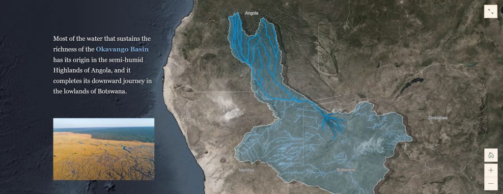
Visual storytelling makes information more engaging and easier to understand by creating a visual narrative that connects data points, explains the significance of data points, and shows how data points relate to other data points. Visual storytelling can be used for a variety of different purposes. But the possibilities for using visual storytelling are limitless. For example, ArcGIS Story Maps puts you in the driver’s seat to build your own digital story that resonates with audiences.
Keep It Simple
When you are presenting your findings to other people, you want to make sure that they are able to understand what you’re saying. By using data visualization to represent your findings, you can help other people understand the information you’re presenting.
When presenting your findings, try to think about how you can more effectively illustrate the information you’re presenting. Simplicity is a key component of effective data visualization. By keeping your visualization simple and to the point, you can help to engage your audience and highlight your key findings.
Although visualizations are a great tool for illustrating your findings, you still want to make sure they are easy to understand, so that people don’t get lost. You also want to make sure that your visualization displays the information you want to show so that it is not cluttered with irrelevant details.

Conclusion
Data visualization is an essential tool for any data analyst. Whether you’re finding important findings in a pile of data or exploring complex relationships between variables, data visualization can help you make sense of your data. In order to use data visualization effectively, you must know the right questions to ask and how to find the right answers. Data visualization is a powerful tool, but it must be used correctly.
As you can see, data visualization is a helpful skill that can help you find important findings in large amounts of data. It can also help you better illustrate the relationship between variables, and engage your audience with helpful visualizations. Whether you are looking for ways to find important data or improve your visualizations, data visualization is a key skill to have.
Related Data Visualization
Data Storytelling: Where Does Data Fit In? A Beginner’s Guide
10 Best Data Visualization Tools and Software For Your Business
Scatterplots vs Bubble Graphs: What’s the Difference?
Tips For Pursuing a Career in Data Visualization
A Comprehensive Guide to Paving a Career in Data Visualization
Excel Data Visualization: 20 Charts, Graphs, and Plots To Master
How to Create a Bar Chart in Excel