How to Create a Bar Chart in Excel
How to create a bar chart in Excel
In this article, you will learn how to create bar charts in Excel. We will provide you with sample data and step-by-step instructions that you can use to follow along. So please go through each step carefully and learn how to create a bar chart in Excel.
What is a Bar Chart?
A bar chart is an Excel graphical representation of data in which bars represent categories or values, and the length of the bars shows how many times that value occurs within that category. We use bar charts to visually compare multiple categories of data at the same time.
Sample Data
In this example, you can use the sample data that we’ve provided below. Copy and paste the table below into Excel.
| Country | Units Sold |
| Canada | 247428 |
| France | 240931 |
| Germany | 201494 |
| Mexico | 203325 |
| United States of America | 232627 |
How to Create a Bar Chart in Excel
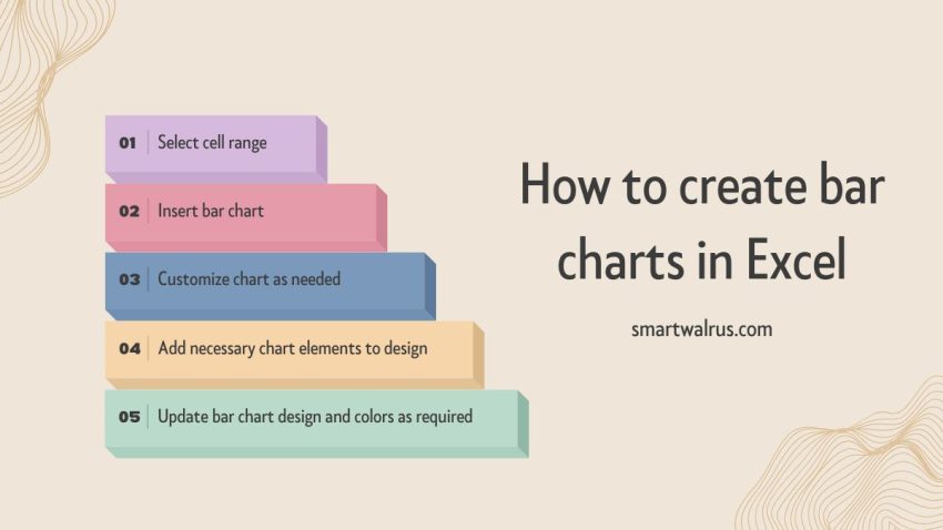
In this section, you will learn how to create bar graphs in Excel. There are three main steps to making a bar chart in Excel
- Select the range of cells from the sample data that you want to display as bars in your chart.
- Click on the “Insert Tab” and select “Recommended Charts”.
- Select the “Bar Chart” option.
If you’ve followed the instructions correctly, then the bar chart will look like the one below.

Customizing Your Bar Chart
Now that you’ve created your bar chart, there are several ways that you can customize it. Select the chart that you want to customize. Next, click the “Chart Design” tab in Excel. Here are some of the ways you can customize your column chart.
Conclusion
In this article, you learned how to create bar graphs in Excel. Bar graphs are visual representations of data that shows the frequency of categories. They are useful for comparing multiple categories of data at the same time.
There are three main steps to making a bar chart in Excel: selecting a range of cells that you want to display as bars in your chart, selecting the bar chart type, and formatting the bars in your chart to customize the appearance and make them easier to read.
Related Data Visualization
Scatterplots vs Bubble Graphs: What’s the Difference?
How to Create a Bar Chart in Excel
Excel Data Visualization: 20 Charts, Graphs, and Plots To Master
A Comprehensive Guide to Paving a Career in Data Visualization
What is Data Visualization and Why Do We Need It?
10 Best Data Visualization Tools and Software For Your Business
Tips For Pursuing a Career in Data Visualization
Data Storytelling: Where Does Data Fit In? A Beginner’s Guide