Excel Data Visualization: 20 Charts, Graphs, and Plots To Master

Excel Data Visualizations
This guide will take you through the basics of Excel data visualization, including how to create 20 of the most eye-catching and useful charts, graphs, and plots.
You will learn how to use them effectively to present data, uncover insights and tell compelling stories. By the end of this guide, you will be a pro at visualizing data with Excel.
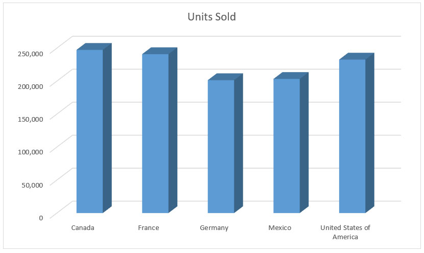
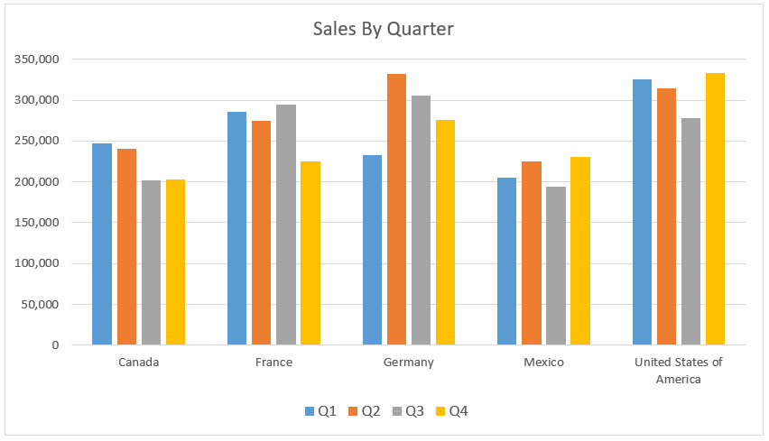
1. Bar Charts
A bar chart is a type of graph or chart used to represent the relative amounts or values of different categories or groups of data. It consists of rectangular bars, with the length of each bar proportional to the value it represents.
Bar charts can represent a wide range of data, including counts of items, frequencies of events, totals, percentages, and other summary statistics. They are one of the most commonly used visual tools for presenting data, and they can be used to effectively communicate a wide range of information.
Bar charts come in two main flavors: horizontal and vertical. While the vertical bar chart visualized data on the horizontal (X) axis, a horizontal bar chart does the opposite. No matter the type of bar chart, you can also add a 3D style in Excel. Learn how to create a bar chart in Excel right now.
2. Line Graphs
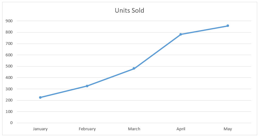
Unlike bar charts, line graphs are more appropriate to visualize continuous data, typically showing changes over time. It is often used to show trends and patterns in data in a simple and straightforward way.
For example, line graphs are useful for visualizing and understanding trends in data over time, such as seasonal change, sales, performance metrics, and so on. They are also useful for visualizing comparisons between different data sets, such as when comparing metrics like profit and revenue over time.
Line graphs come in two main varieties: line charts and area charts. While area charts fill in the volume beneath the data points, line graphs leave the area blank (like below). These types of graphs in Excel can also be stacked and 3D.
3. Pie Charts
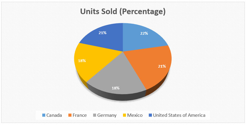
Pie charts visualize qualitative data. They are most often used to show the proportion of each data category. For example, they can display the percentage of each region’s population or the percentage of each type of sales.
They are not useful for showing comparisons between data points or calculating actual values. Pie charts are an old-school data visualization tool that is often criticized for being overused, poorly designed, and difficult to read.
They have been largely superseded by other visuals such as bar charts, column charts, or even the more stylish doughnut chart (see #4) that is often easier to read and interpret.
4. Doughnut Charts
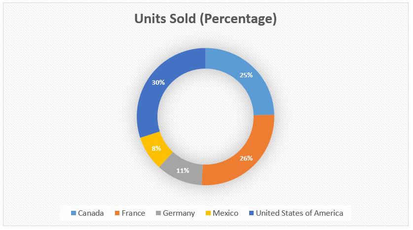
If you don’t like pie, perhaps you might prefer a doughnut? A doughnut chart, that is! Although doughnut charts are a relatively new data visualization tool, they are quickly gaining popularity amongst data visualization experts.
A doughnut chart is really just a variant of a pie chart with a hole in the center. Instead of showing categories like slices of a pie chart, doughnuts show each category as arcs.
Doughnut charts are especially good for visualizing one or more series of data, typically showing a comparison between different groups. They are easy to create using Excel, and they offer a unique and interactive way to visualize data.
5. Column Charts
A column chart is a type of graph or chart that uses vertical bars to represent different categories of data, with the height or length of the bar representing the magnitude or frequency of the category.
Column charts are useful for showing how a particular metric is distributed across a categorical axis. For example, they may show the percentage of each sales territory, the percentage of profit generated by each product category, etc.
They are commonly used in Excel business presentations and reports to quickly illustrate trends and patterns in data. The two main varieties that you can create in Microsoft Excel are: stacked and clustered.

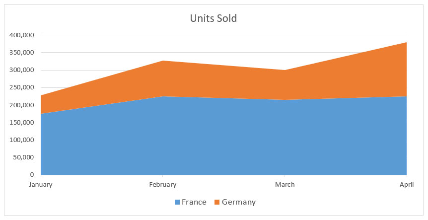
6. Area Graphs
An area graph is a type of chart or graph that displays information using a range of data points connected by straight lines and filled in with color or shading. It is similar to a line graph, but the area between the x-axis and the line is filled in with color or shading to indicate volume.
Area graphs emphasize the magnitude of change over time and can be used to compare different categories of data. They are typically used to illustrate trends over time or changes across different categories, such as population growth in different countries.
The area under the line can also be used to show cumulative totals. The types of varieties in Microsoft Excel for area graphs are stacked, 3D, and various combinations of stacked and 3D.
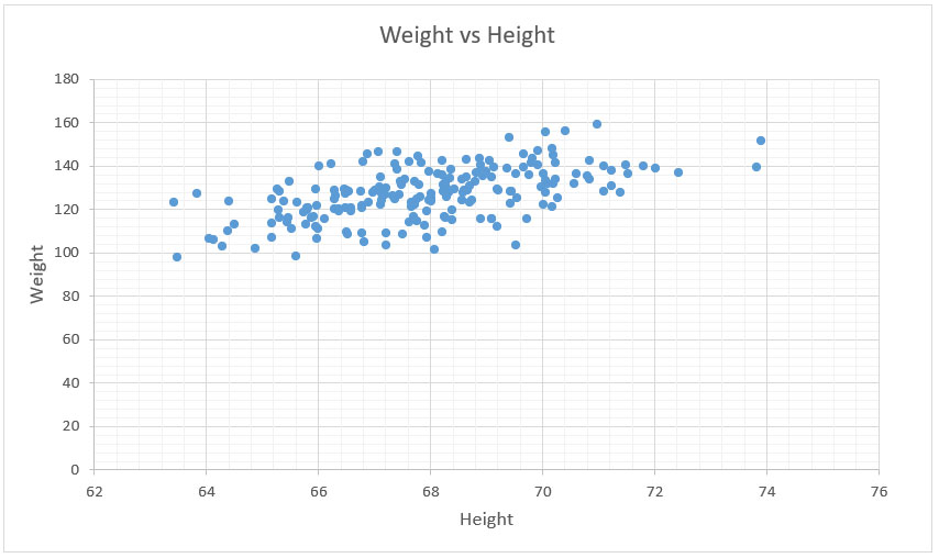
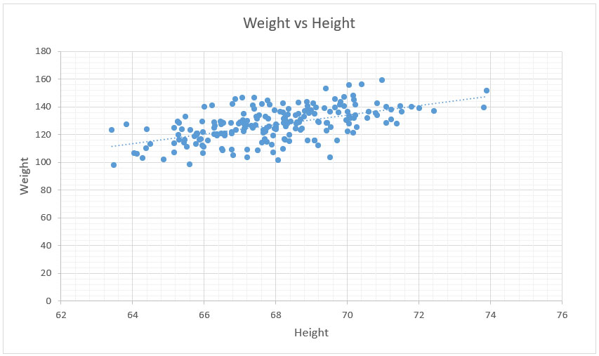
7. Scatter Plots
A scatter plot is a type of graph used to plot pairs of numerical data on a two-dimensional (2D) graph. It is used to show the relationship between two variables and can be used to determine if there is a correlation between them.
Scatter plots are also referred to as scatter diagrams, scatter graphs, or scattergrams. A scatter plot is created by plotting each point in a dataset on a two-dimensional graph. Each point represents one pair of data from the dataset.
The horizontal axis of the graph typically represents the independent variable, while the vertical axis of the graph represents the dependent variable. It is important to note that the axes do not need to be in order for the graph to be valid. This means that the independent and dependent variables could appear on either axis.
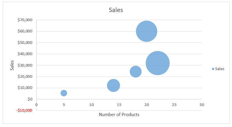
8. Bubble Graphs
A bubble graph, also known as a bubble chart or bubble plot, is a type of chart that displays data using circles. Each circle represents an individual data point, with the size of the circle representing the value of the data point.
Bubble graphs are used to compare and analyze the relationships between different data points, and can be used to identify patterns or correlations. Bubble graphs can be used to visualize data from a variety of different sources, such as demographics, financial information, and more.
In Excel, it’s also possible to add 3D effects to each data point. So instead of a circle, each point is a sphere. They provide an effective way to visualize and interpret large amounts of data quickly and easily, making them useful tools for researchers, analysts, and decision-makers.
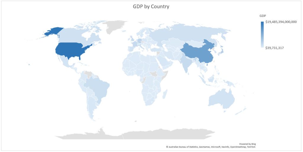
9. Maps
Maps are used to visualize one or more series of data, typically showing the distribution of one or more metrics across geographical regions. They are created by plotting values to a list of countries/regions, states, counties, or postal codes.
Maps are useful for visualizing the distribution of data across geographical regions. For example, they can show the distribution of sales across different countries, the distribution of product adoption rates across different states, etc.
Maps are extremely effective visuals when the data is geographic in nature. They are best used when the data you are visualizing can be mapped with geographic coordinates. Another type of map is a “heat map”, which allows you to visually represent the relative size of data points.
READ MORE: What Is Geographic Information Systems (GIS)?
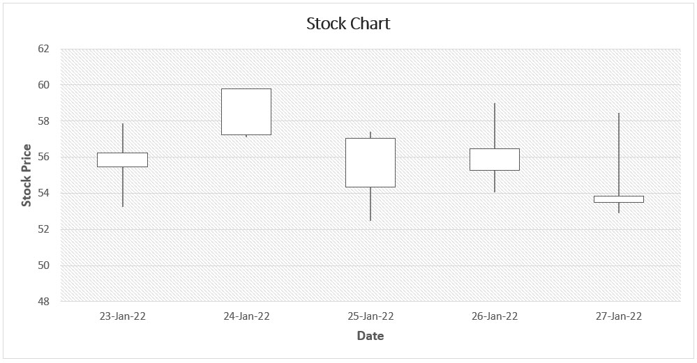
10. Stock Charts
A stock chart is a type of chart used to visualize and analyze the price history of a particular stock or financial market. Stock charts are an incredibly useful tool that can be applied in a variety of different contexts, from financial trading to marketing and product management.
There are various different types of stock charts available in Excel. The two most common are the candlestick chart and the line chart. Candlestick charts are typically used to analyze short-term price movements, whereas line charts are generally used to analyze price movements over a longer time period.
The chart is composed of a series of “candlesticks” which represent different price actions during the trading period. The open, high, low, and close prices of the security are represented in each candlestick. The body of the candlestick is the area between the opening and closing prices.
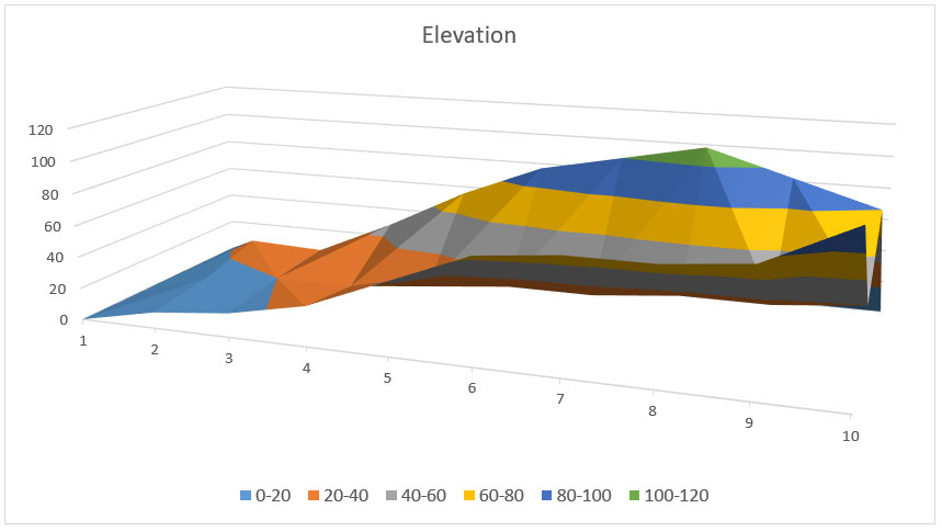
11. Surface Graphs
Surface graphs are one of the more unique chart options available in Excel and are useful for visualizing multiple dimensions of data. This allows users to visualize the relationships between different data sets at a glance.
They are useful for visualizing complex relationships between data sets that are not easily summarized in a single chart. Surface graphs are a bit more challenging to create than other types of charts.
For example, surface graphs are often used to represent the relationship between variables such as temperature, pressure, density, and volume. There are different varieties of surface graphs including 3D surface, wireframe, and contour.
12. Regression Plots
A regression plot is a type of chart used to visualize the relationship between two variables, typically denoted as x and y. It is used to analyze the linear relationship between the two variables and draw a line of best fit, or regression line, through the data points on the chart.
The line of best fit is used to make predictions about the relationship and can be used to estimate the value of one variable when the other is known. Regression plots are used in a wide variety of fields, such as economics, sociology, psychology, and engineering.
An R-squared value is a statistical measure that represents the proportion of the variance for a dependent variable that’s explained by an independent variable or variables in a regression model. Generally, the higher the R-squared value (closer to 1), the better the model fits your data.
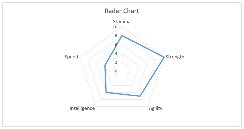
13. Radar Charts
Radar charts, or spider charts, are another unique chart type that is useful for visualizing multiple dimensions of data. They display multivariate data in the form of a two-dimensional chart with three or more quantitative variables represented on axes starting from the same point.
Each variable is plotted along its own axis on the chart and connected together to form a polygon. Radar charts are useful for comparing the features of multiple items on one or more variables.
They can also be used to identify trends or patterns in the data. Radar charts can be used to compare different products, teams, or employees and to track changes over time. They are also often used to compare data from different sources or locations.
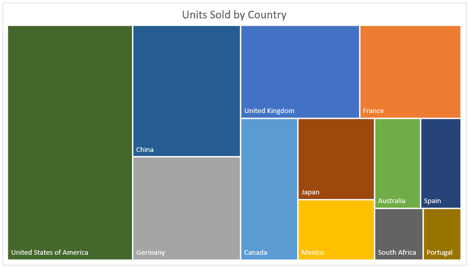
14. Treemaps
A tree map is a type of data visualization that uses nested rectangles to represent the hierarchical structure of a dataset. Treemaps are useful for displaying the relative size of different categories in a dataset and their relationships to one another.
They can be used to display large amounts of information in an easy-to-understand format, making them a popular choice for visualizing data in many different fields. Treemaps are particularly useful for exploring and comparing multi-dimensional datasets, such as budgets, market shares, and population trends.
They can also be used to compare distributions between different kinds of data, such as income levels or geographical regions. Treemaps can be used to analyze a variety of data sources, including business intelligence, financial analytics, and scientific research.
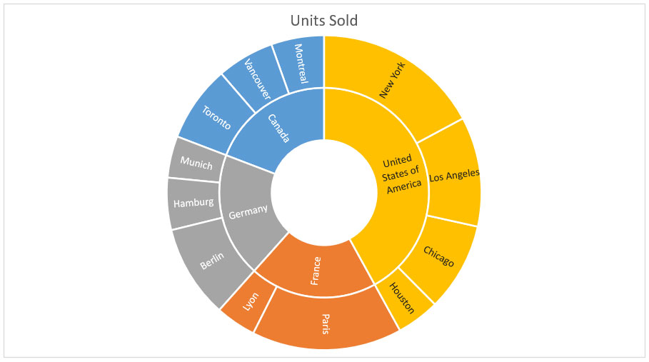
15. Sunburst Charts
A sunburst chart, also known as a radial tree diagram, is a type of data visualization that is used to represent hierarchical data in an easy-to-understand graphical format. They are becoming increasingly popular due to their ability to quickly provide insights into complex data sets.
A sunburst chart is composed of several rings or levels that branch out from the center to show different categories or values associated with the data. The size of each ring or level corresponds to the size of the category or value it represents, with larger rings indicating larger values.
Sunburst charts are especially useful for showing how different parts of a whole are related, and for displaying the relative sizes of different elements in a hierarchy. They can be used to visualize data in many different fields, such as business, finance, marketing, science, engineering, and technology.
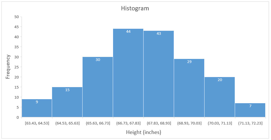
16. Histograms
A histogram is a type of graph that is used to compare and contrast data sets, identify patterns, and understand trends. It displays the frequency or number of observations of a particular data set in a given range of values.
The data points are grouped together into bins, and the height of each bin indicates the frequency of observations within that bin. Histograms are useful for analyzing large amounts of data, such as survey results, financial data, and scientific experiments.
Histograms can be used to quickly identify the shape of a distribution, such as whether it is symmetric, skewed to the left, or skewed to the right. They can also be used to identify outliers and areas of potential interest.
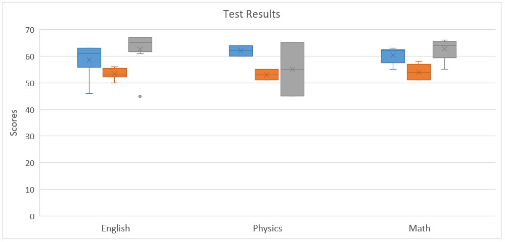
17. Box & Whisker Plots
A box & whisker plot (also known as a boxplot) is a graphical representation of the distribution of numerical data. It is a way of displaying the five-number summary of a data set, which includes the minimum, first quartile, median, third quartile, and maximum value of the data set.
The boxplot is useful for quickly summarizing the median, spread, and skewness of a data set. It also helps to identify outliers and compare multiple data sets. It also helps to compare different sets of data and identify similarities or differences between them.
Boxplots are often used in exploratory data analysis to quickly visualize a dataset’s distribution and get a better understanding of its characteristics. It can be used to identify patterns, trends, and outliers in the data.
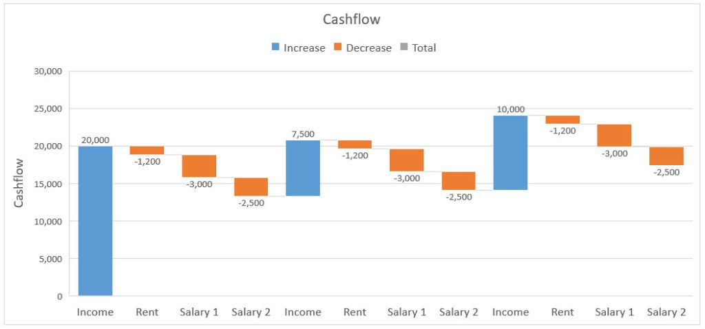
18. Waterfall Diagrams
A waterfall diagram is a type of chart that illustrates how different components of a process are dependent on one another. This type of chart is typically used to visually depict the progression of a project or process, from the beginning stages to the end result.
The waterfall diagram shows each step of the process or project and how the completion of one stage impacts the next. This allows for an easy understanding of the dependencies of each step, as well as a clear view of how each stage connects to the overall goal.
In addition, the waterfall diagram also allows for a better understanding of the timeline of a project or process, highlighting any areas that may have delays or need additional attention. Waterfall diagrams can be used in many different types of projects, including software development, product design, marketing campaigns, and more.
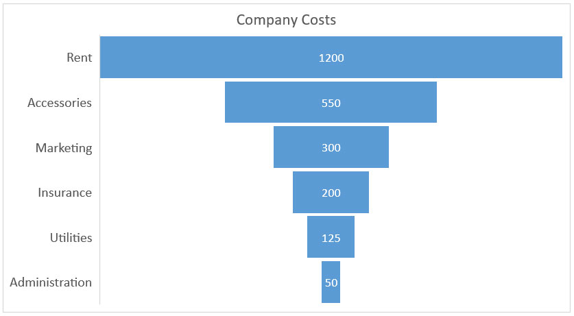
19. Funnels
A funnel chart is a type of chart used to visualize the progressive reduction of data as it moves through a process. It is commonly used to illustrate the steps in a sales, conversion, or user onboarding process.
Funnel charts can help organizations better understand their processes and identify areas for improvement. For example, a funnel chart can reveal where potential customers are dropping out or where there are issues with user onboarding.
The chart can also be used to compare different processes, such as comparing two different marketing campaigns or different versions of a website. But the focus is displaying values or drop-off from one stage to the next.
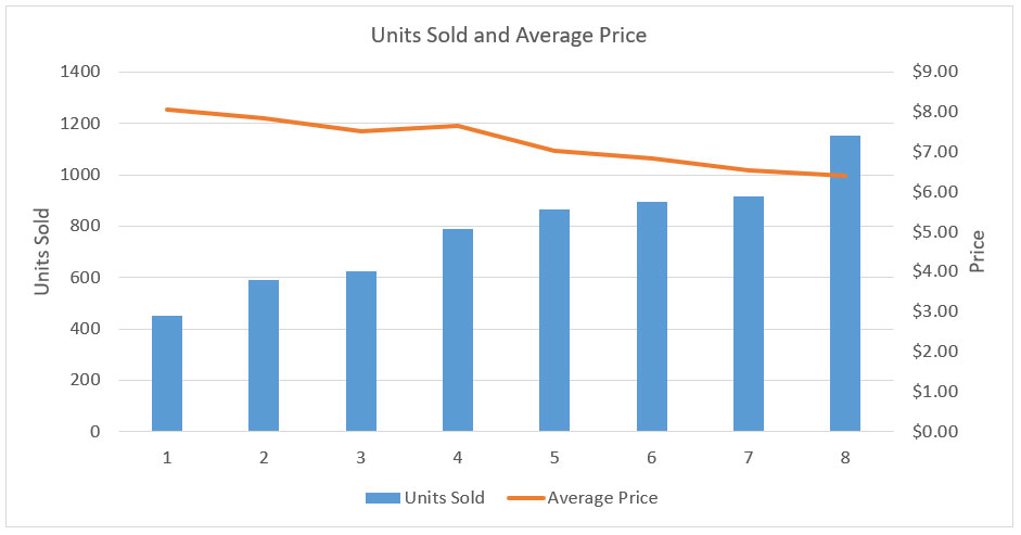
20. Custom Combination Charts
Custom combination charts, or simply “combo”, are created by combining different types of data visualization, such as multiple columns, line, and area graphs. The main purpose of custom combination charts is to visualize multiple data sets at once.
This can be useful when wanting to display multiple sets of data in a single chart and to make it easier to compare the different sets of data. Combination charts can also be used to compare data from different sources or to show the effects of an intervention or policy change.
For example, a custom combination chart can be used to show sales figures for different products on the same chart, with one set of data represented as a line chart, and another set represented as a bar chart.
Conclusion
That concludes our tour of the most common charts, graphs, and plots that you can visualize data with. With the ability to create complex and visually stimulating charts, graphs, and plots, Excel allows users to quickly and accurately analyze and present data in an easily digestible format.
Whether you are a beginner or an experienced user, learning to visualize data with Excel and understanding the different charts, graphs, and plots available is an essential skill for anyone who works with data.
Now that you know all about visualizing data with Excel, it’s time to put your knowledge into practice. We invite you to fire up Microsoft Excel and get ready to create some awesome data visualizations.
Related Data Visualization
A Comprehensive Guide to Paving a Career in Data Visualization
Data Storytelling: Where Does Data Fit In? A Beginner’s Guide
10 Best Data Visualization Tools and Software For Your Business
What is Data Visualization and Why Do We Need It?
How to Create a Bar Chart in Excel
Scatterplots vs Bubble Graphs: What’s the Difference?
Tips For Pursuing a Career in Data Visualization